2024.10.18 Website update: Dark mode implemented!
Here it is. Dark mode.
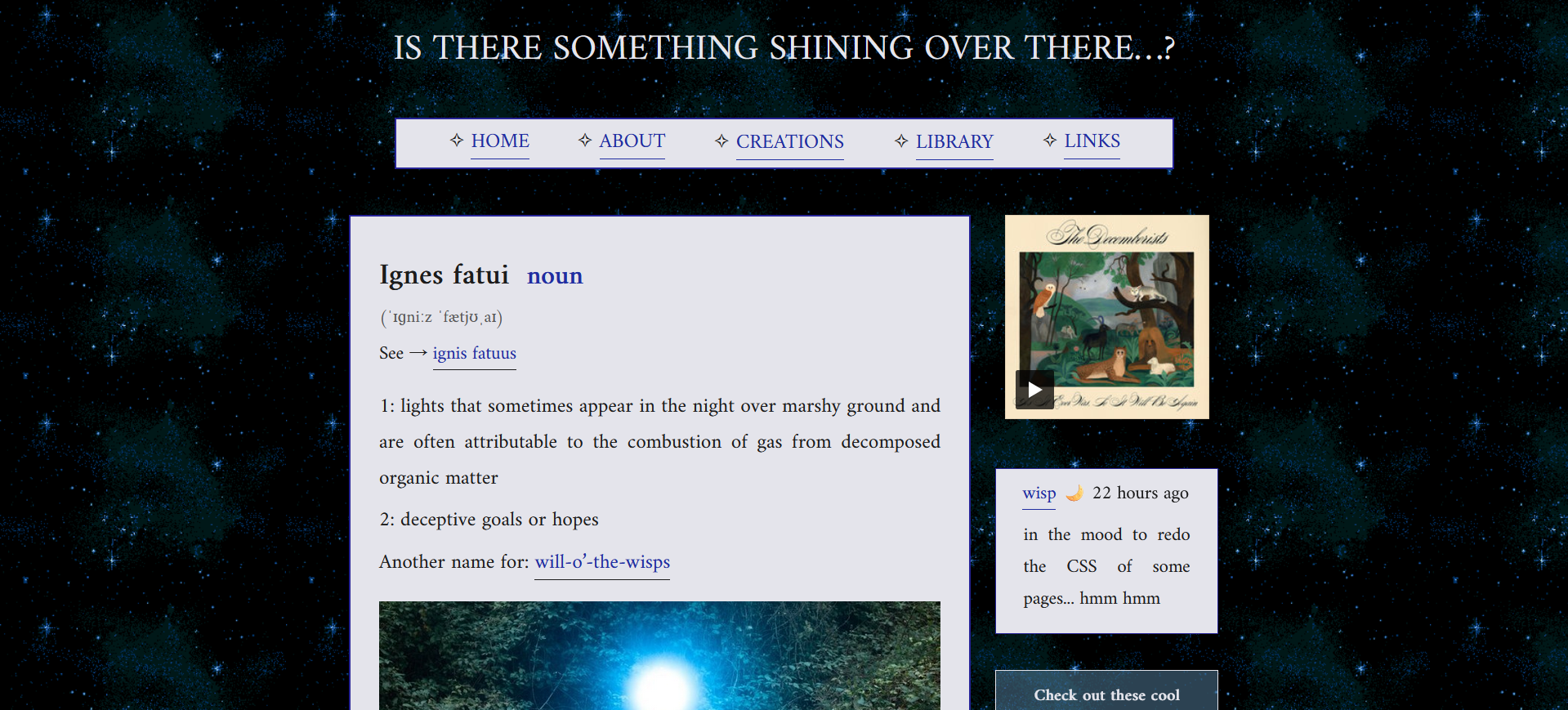
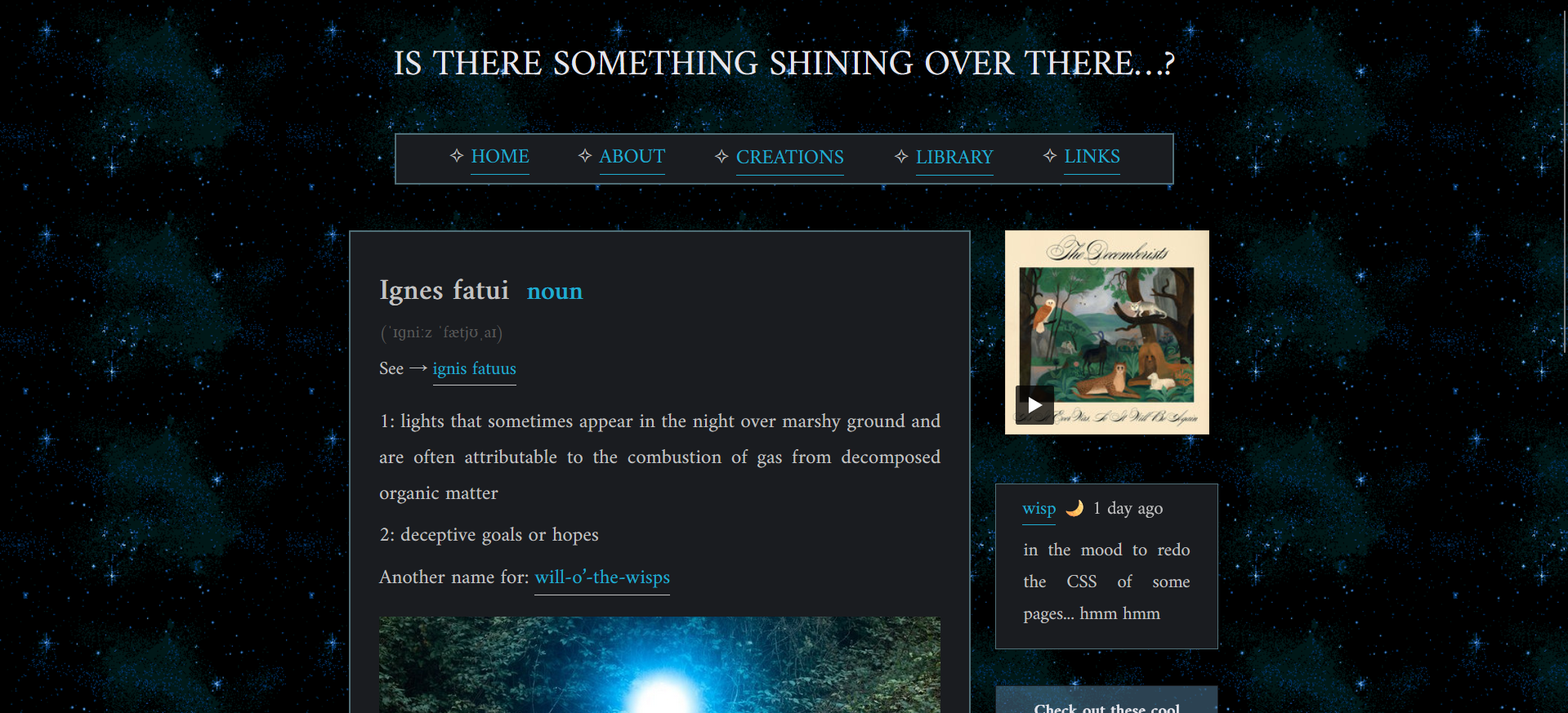
I’ve made a LOT of improvements and tweaks to the entire website’s CSS in the past few days, so I decided it is time to make myself feel important and write a brief update of sorts. Why not? The dark mode is only a cherry on top, after all.
First I decided that the previous font size, while readable, was still a bit too small for my liking, so I increased it from 18px to 20px. (Keep in mind that Amiri1 tends to be a bit smaller than other fonts, so Amiri’s 18px is not as big as Times New Roman’s 18px, for example.) A day later I realized that the font was now too big on mobile devices (or at least, on my mobile device), so I went and edited all of the stylesheets yet again to include the line
@media screen and (max-width: 1000px) {
body{
    font-size:18px;
}
Now scrolling through our essays on your phone won’t feel like a chore, hopefully.
I also got rid of all the silly little gifs that had previously been placed between the links on each page. They certainly were cute, but they made the website feel a bit cluttered; moreover, I was not sure if, despite being small and relatively slow, they weren’t making some people’s eyes hurt. Sometimes, when we were checking the website while tired, they certainly hurt ours. So it was time to let them go – I replaced them with a sparkle symbol to avoid making the link section too simple.


In preparation for implementing dark mode, I went through all of the CSS stylesheets and added a :root section to make colour-switching possible. Turning all of the hex codes into CSS variables was a bit time-consuming, since I took this opportunity to polish some pages’ colour palettes along the way. (I also adjusted the width of some pages to make reading them feel smoother.)
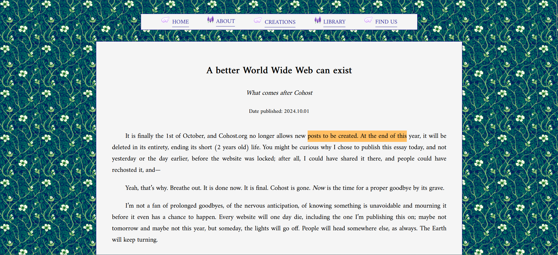
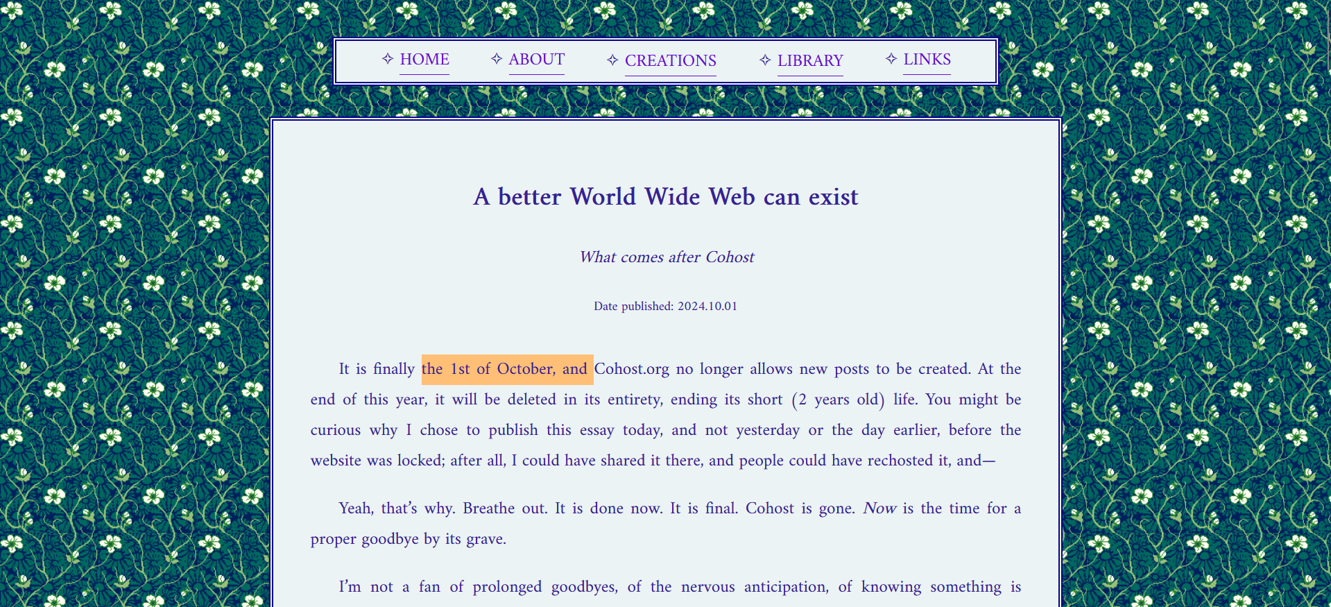
If you’re curious why I decided to change the black font into something more colourful: a while ago we have had the revelation that it becomes way, way easier for us to sit our ass down and focus on reading a book if we set our ebook reader’s settings to be more colourful. Text written in black makes us feel bored and subconsciously seek distraction, but just slightly changing the font colour fixes the issue entirely. So, obviously, longer pieces on our own website are going to be written in a way that makes us have an easier time reading them!
After that I finally proceeded to implement dark mode. It is NOT satisfactory: you can’t turn it on and off whenever you want, it simply works by detecting whether the device you’re using is set to dark or light mode. You can’t have your phone on dark mode and still view the default, light version of the website. Implementing a switch button will require us to figure out some JavaScript, but we are planning to eventually get around to doing it – mostly so you can decide which version of our website looks nicer to you and choose the style you want.
Having said this: if you need dark mode for accessibility reasons, it is now available and will be turned on for you by default. That is all that matters.
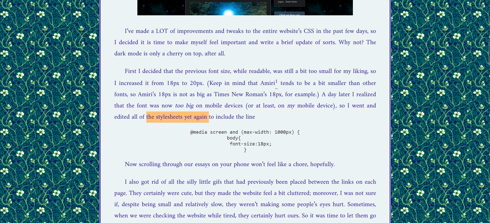
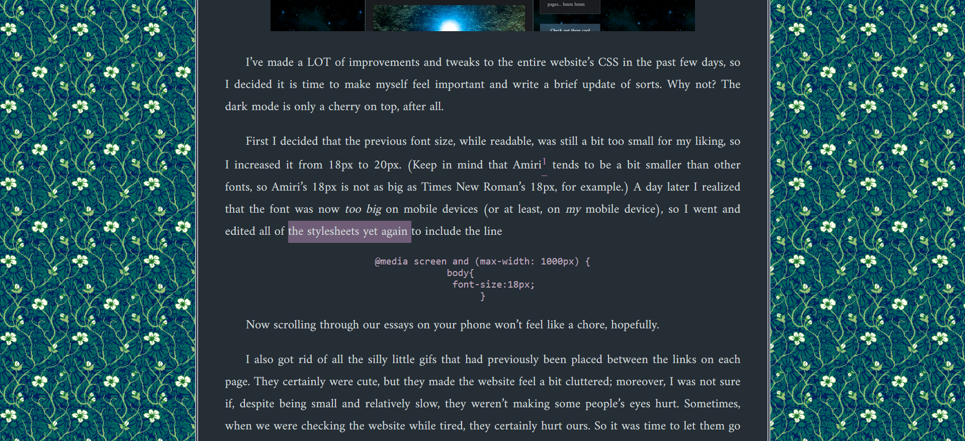
(The colours might be slightly changed/adjusted in the future to make the website look better. I am not even half as satisfied with our dark mode look as with the default one.)
I achieved this by putting this simple piece of code into the CSS stylesheets:
@media (prefers-color-scheme: dark) {
    :root {

    }
}
It’s quite easy to do, since all you have to do is change the variable hex codes to another version without dabbling with the rest of the code. The most time-consuming part of this was coming up with new colour palettes from scratch (some of our default colour choices don’t look that well in dark mode).
I made sure to make all of the pages dark while paying attention not to set the contrast to be too high – in case you’re one of the people who feel bothered by this, I’m sorry, but I have astigmatism and avoiding high contrast backgrounds2 is an accessibility requirement for me ¯\_(ツ)_/¯
Additionally, the poetry section required me to entirely change the background image for dark mode, which… I’m not very happy about, and that makes me want to implement the “turn dark mode on/off” button ASAP. Alas, the default background is way too bright to work well with dark mode, especially since the poetry page is supposed to be very thin, and therefore the background takes up a lot of space. For now I’ve borrowed the floral image from library’s background, but it might eventually be changed to something else when we find a good alternative.
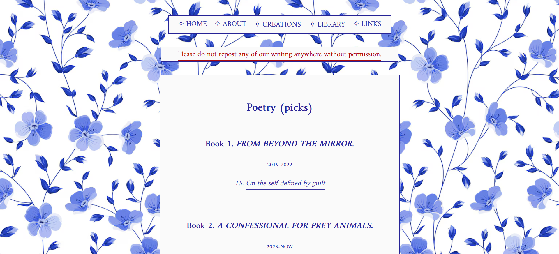
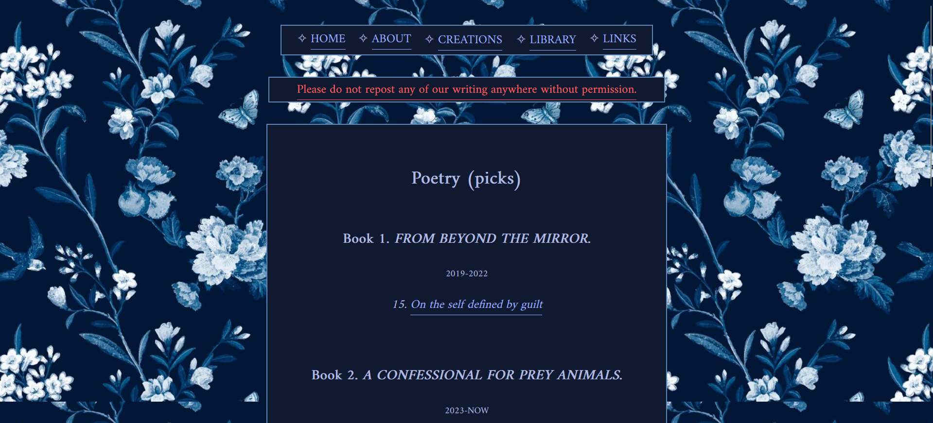
All in all, do keep in mind that the website is supposed to be viewed in light mode by default; dark mode works, and I did my best to make it look good, but it’s just never going to get as much love from us as light mode 😔
Also, naturally, if anything looks broken, remember to press ctrl+shift+R!!!
1 As to why we chose Amiri as this website’s font: it makes our brain feel good. That’s the only reason, really. We have it set up as a default font in our Obsidian app too – it makes the process of writing & reading more pleasant than any other font for some reason.
2 No, moving your cursor slightly up from pure black on the colour wheel does not make it less painful for astigmatic eyes. I could never use Cohost’s dark mode, for example, because their “not-black” was just as inaccessible as actual black for me. Don’t even get me started on the topic of websites that don’t even try and just use pure black though…